Index  /  Case 02  /  AntSeed

Peer-to-peer AI, reduced to one switch.

Full design for AntSeed, an open peer-to-peer market for AI inference: brand, macOS app, marketing site and motion. All of it had to make sense in the four seconds before someone closes the tab.


AntSeed VPR desktop app, connected state, on a macOS desktop
RoleProduct Designer · freelance
Year2026
TeamSolo designer · founder · eng
ScopeBrand · desktop app · site · motion
Fig. 01 - antseed.com · hero, live · 19s loop Visit antseed.com
01 / Context

A market with no company in the middle.

AntSeed moves AI requests the way BitTorrent moves files. Providers set their own prices, buyers route by price, latency, reputation or privacy. No aggregator taking a cut, no account to create.

The brief

The engineering was already real: a DHT, a routing protocol, on-chain settlement. What was missing was any reason for a normal person to want it. My job was everything outside the protocol: the mark, the app, the site and the films.

The audience splits in two: developers who judge it on architecture, and people who just want their coding agent to cost less. One surface had to serve both without patronising either.

P2P sells itself on architecture. Nobody adopts it for architecture.
AntSeed logo · an ant whose legs terminate in network nodes, with the wordmark

An ant whose legs end in nodes. It is already a graph, so one shape carries the brand, the app icon and the films.

02 / Diagnosis

The category's whole vocabulary works against it.

Decentralized products inherit dashboards, node graphs and dark terminals. That reads as "infrastructure" to engineers and "not for me" to everyone else.

What was hard

The value is invisible. Routing happens in milliseconds, through providers the user never meets, and the saving arrives as an absence: a bill that did not grow.

"Peer-to-peer" and "on-chain" also promise configuration, wallets and risk, while the real job is mundane: point your tools somewhere cheaper and carry on.

Invisible value Crypto adjacency Two audiences No visible product Trust before spend

The approach

Anchor the product to one physical control. The VPR opens on a power button the size of a fist: on or off. A user who understands nothing else understands that.

Then show the money where it is earned. Every model row strikes the official price through against the live one, so the saving is a number, not a headline.

Warm paper, not black glass, with green reserved for what is actually live.

One control Price as proof Warm surface Green means live Tools unchanged
03 / Process

Everything argued out in grey first.

Two full grey passes before anything was styled. Each screen answered one question, and most of what changed was not layout but naming.

How it ran

Grey lets structure and wording get argued before anyone reacts to colour, and it is the one version a founder and an engineer read the same way.

The pass that mattered most was the money: a credits label, a dollar figure and a separate token with its own Claim button, all fighting for attention. Settling it here was far cheaper than after the visual pass.

The grey set 8 screens · pass 01 and 02
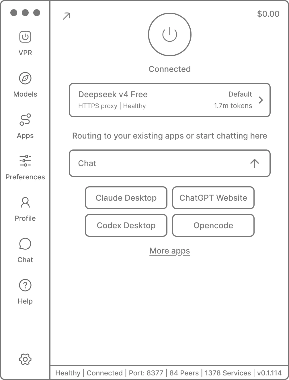
Wireframe: Home
01 Home · the switch

One control, one word of state, one default model. The test: can the app be understood with the power control as its only hierarchy?

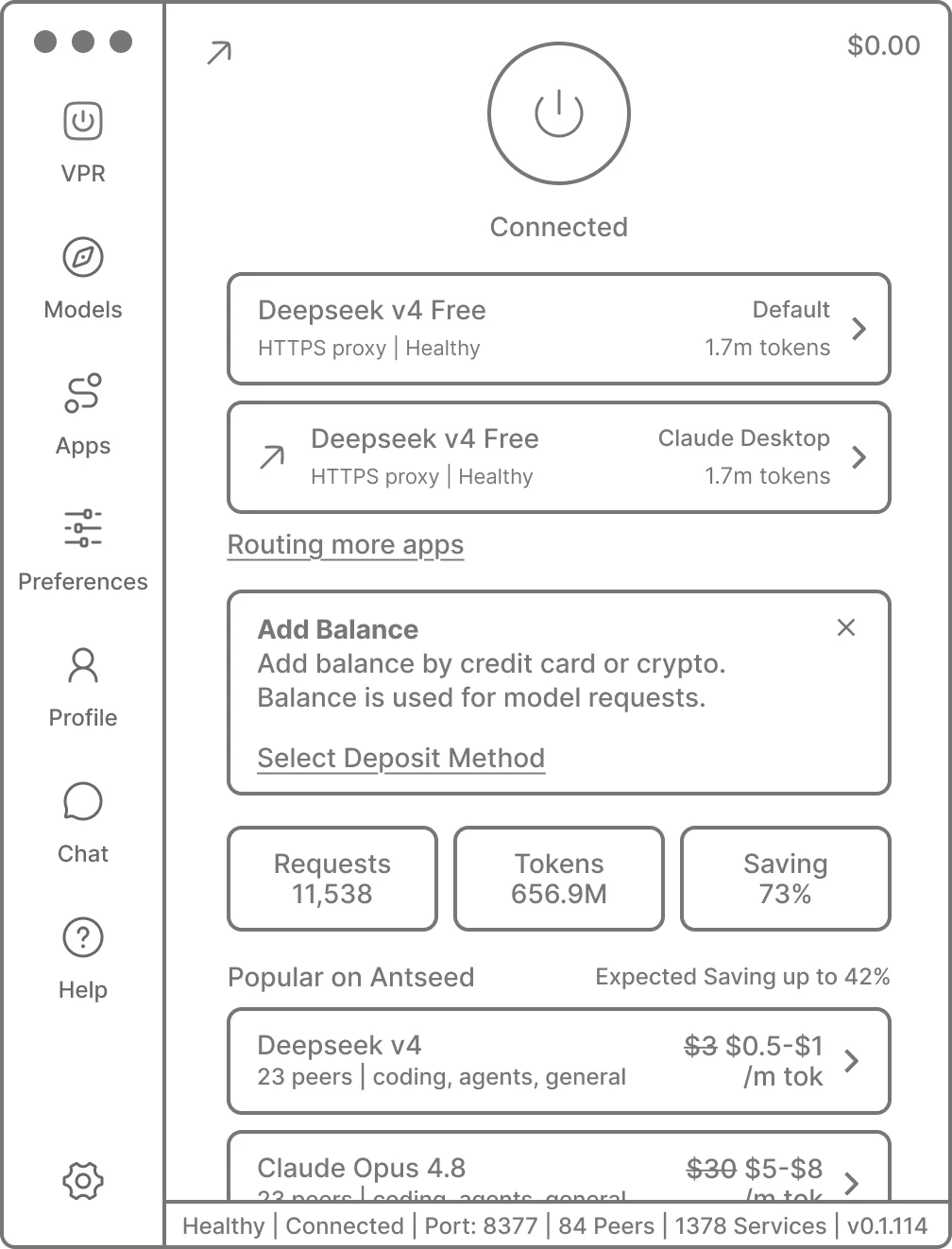
Wireframe: Home
02 Home · in use

How much can this screen carry before it stops reading as a switch? Too much. The Popular list pushed it over and moved to its own view.

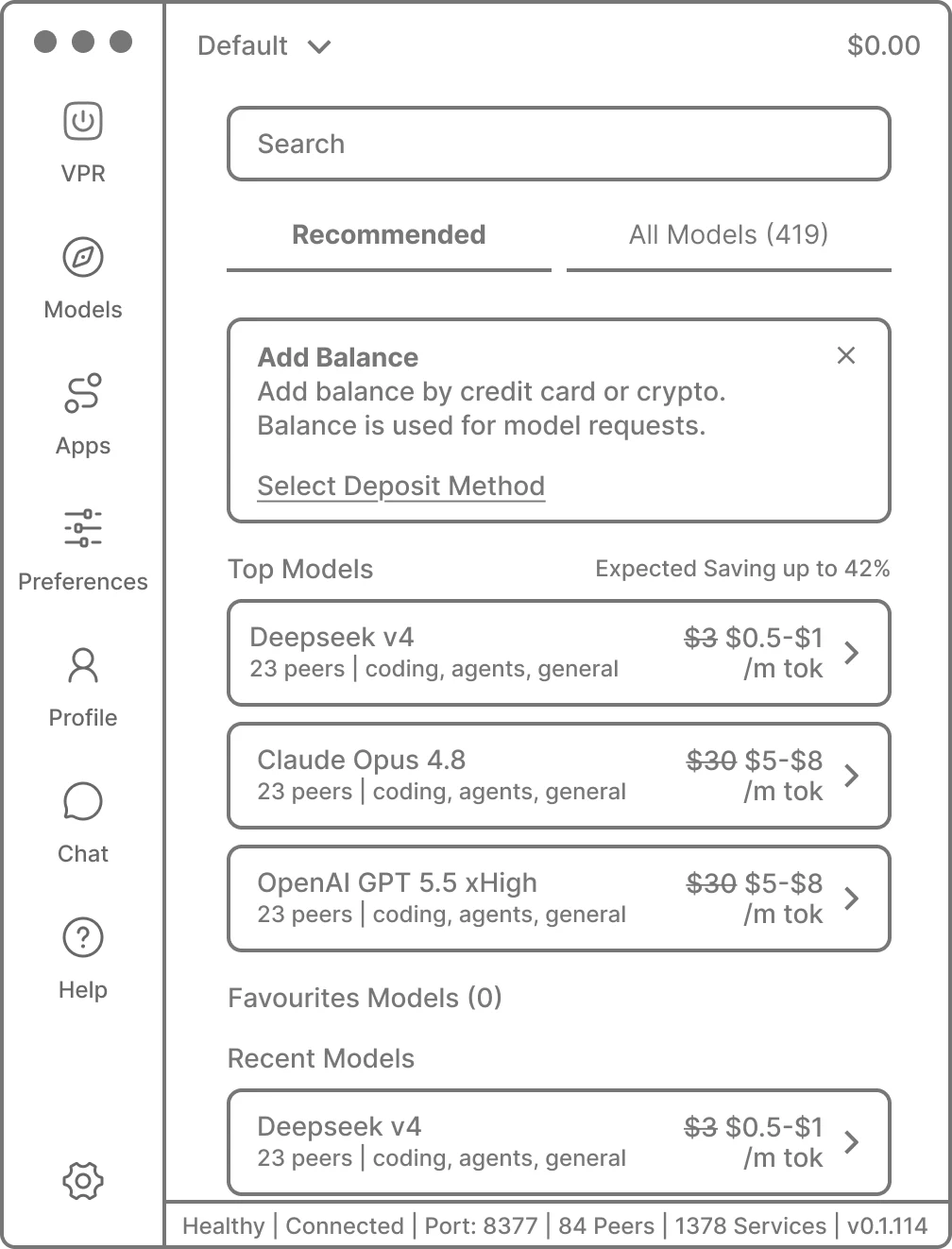
Wireframe: Models
03 Models · the market

419 models is a filtering problem first. Recommended lands, All Models waits behind a tab, and Favourites and Recent give the market a memory.

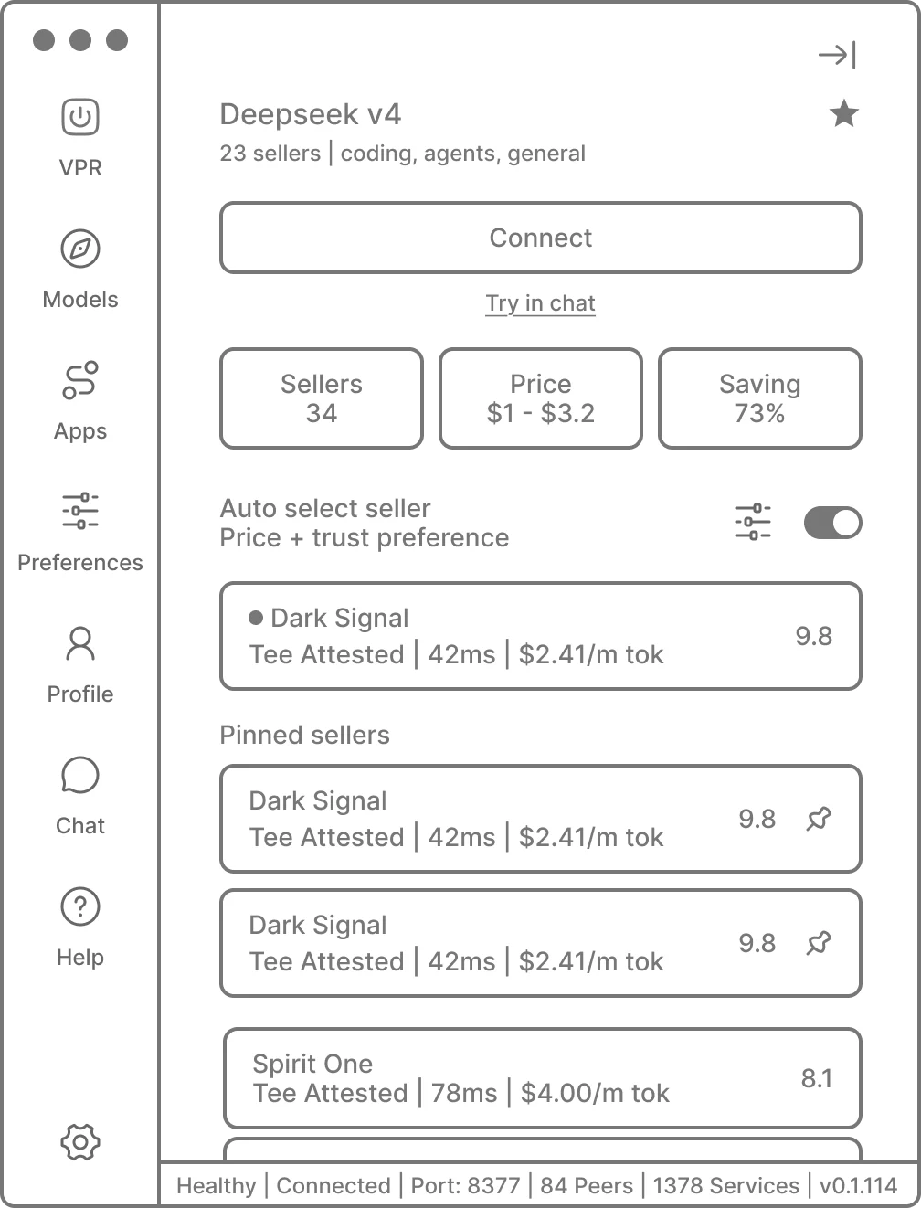
Wireframe: Model
04 Model · the sellers

Where delegation gets decided. The Auto toggle sits right above the list it governs, and switching it off hands you Pinned sellers instead of taking something away.

Wireframe: Tools
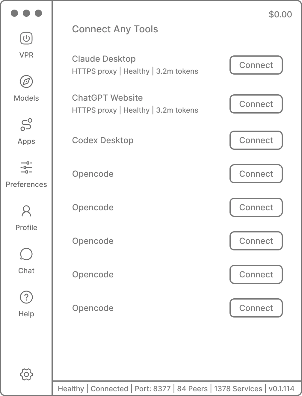
05 Tools · connect

The product's argument is that your setup doesn't change. One identical button per row, so it reads as things that already work, not a setup process.

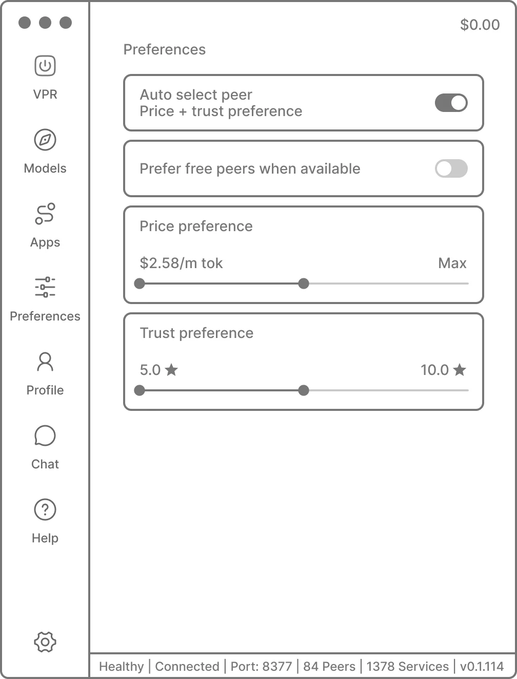
Wireframe: Preferences
06 Preferences · the floor

Auto-routing sends a prompt to a stranger's machine, so the bounds had to be few: two sliders, two toggles. In grey, no control said what it does, which rewrote the shipped version.

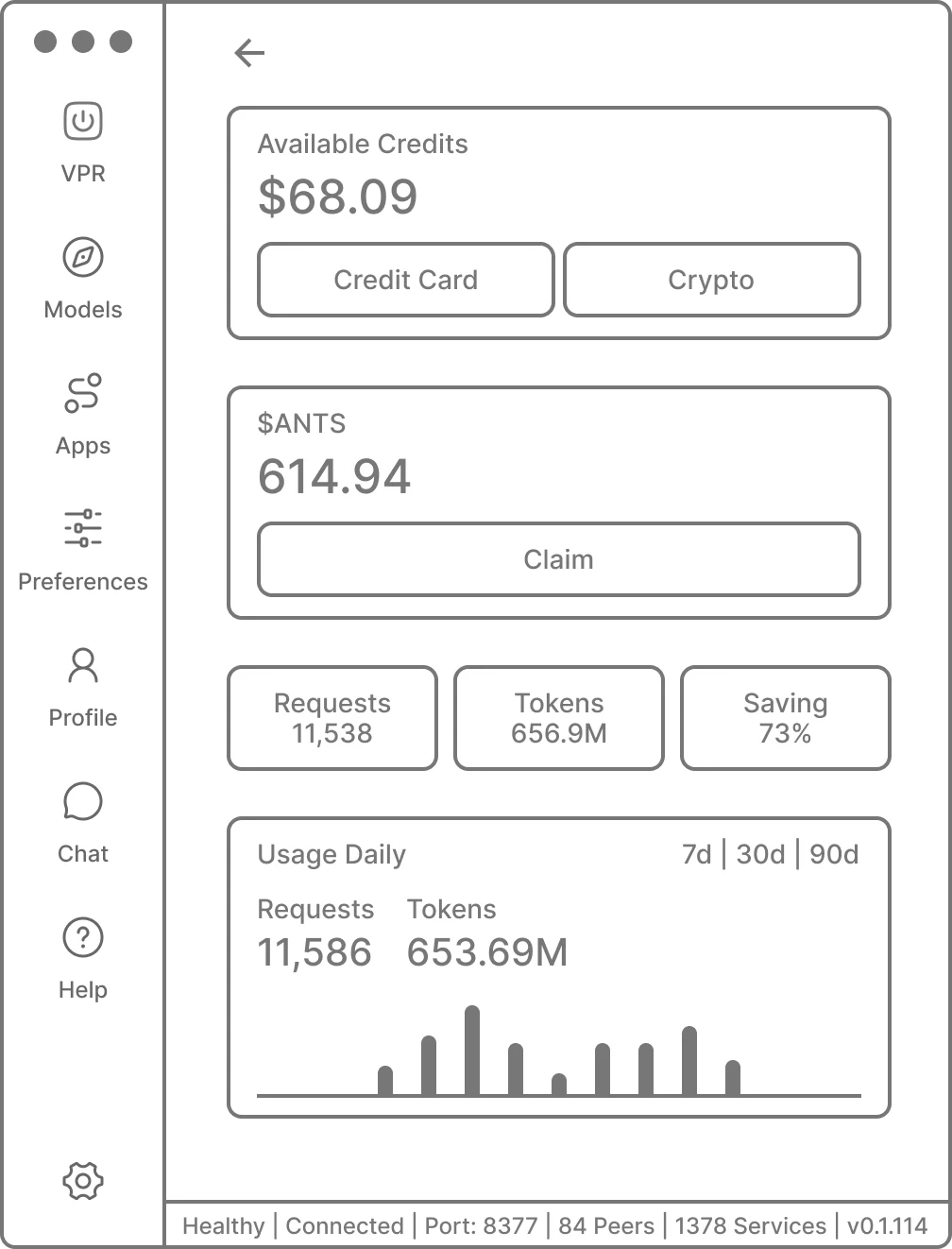
Wireframe: Profile
07 Profile · the money

Balance, token, usage and history together exposed the problem: a Credits label over a dollar figure, plus a second currency with its own Claim button. Two units, three names, one balance.

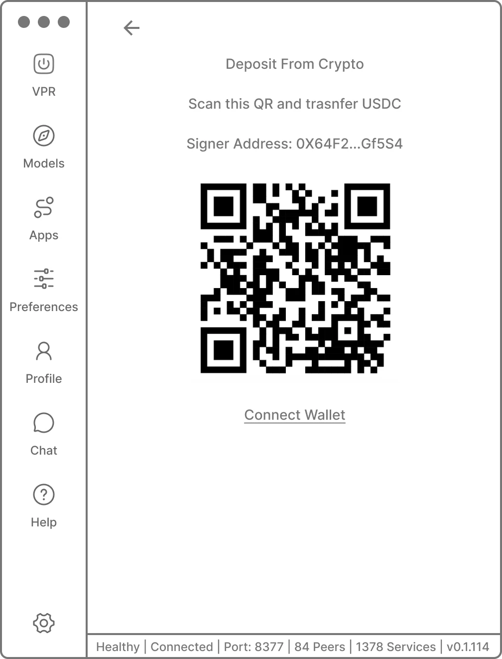
Wireframe: Deposit
08 Deposit · crypto

A QR code and a signer address: right for wallet holders, a dead end for everyone else. Crypto could not be the front door to paying.

04 / The interface

Nine screens, one switch.

The Virtual Private Router is the product you hold: a macOS app that exposes an OpenAI and Anthropic compatible endpoint on localhost and routes every request across the open market.

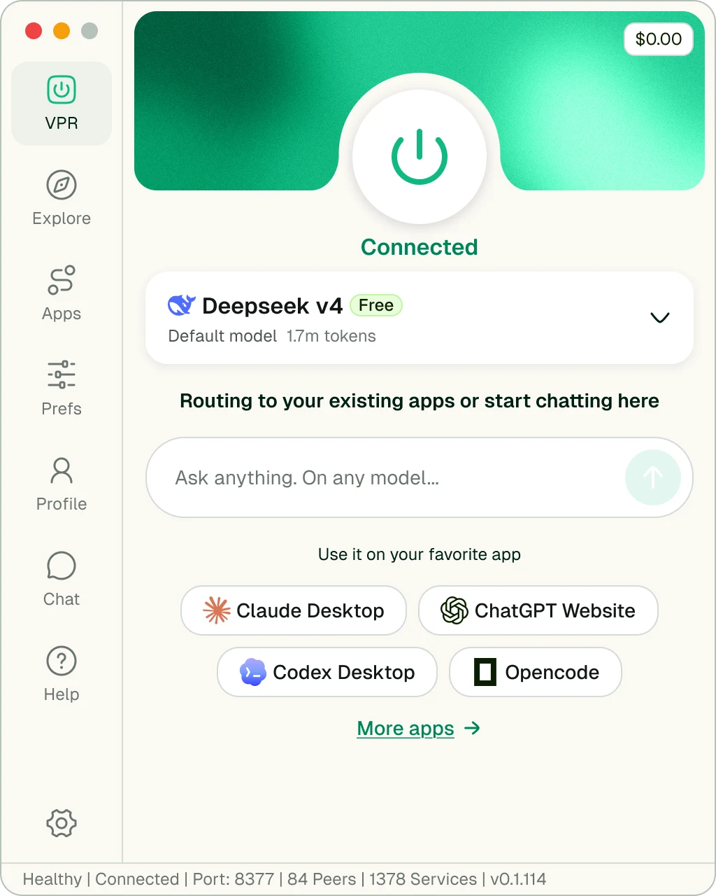
AntSeed VPR · connected
/vprPower · Default model · Apps
4.1 - VPR

The whole product is one button.

A power control and one word of state. Everything below it is optional detail, and the button is deliberately oversized, because its size is the message.

  • UI decisions
  • Power control sized past any guideline
  • One word of state, in green, with nothing competing against it
  • Status bar is the only place the protocol speaks: port, peers, services, build
/vpr Power · Default model · Apps
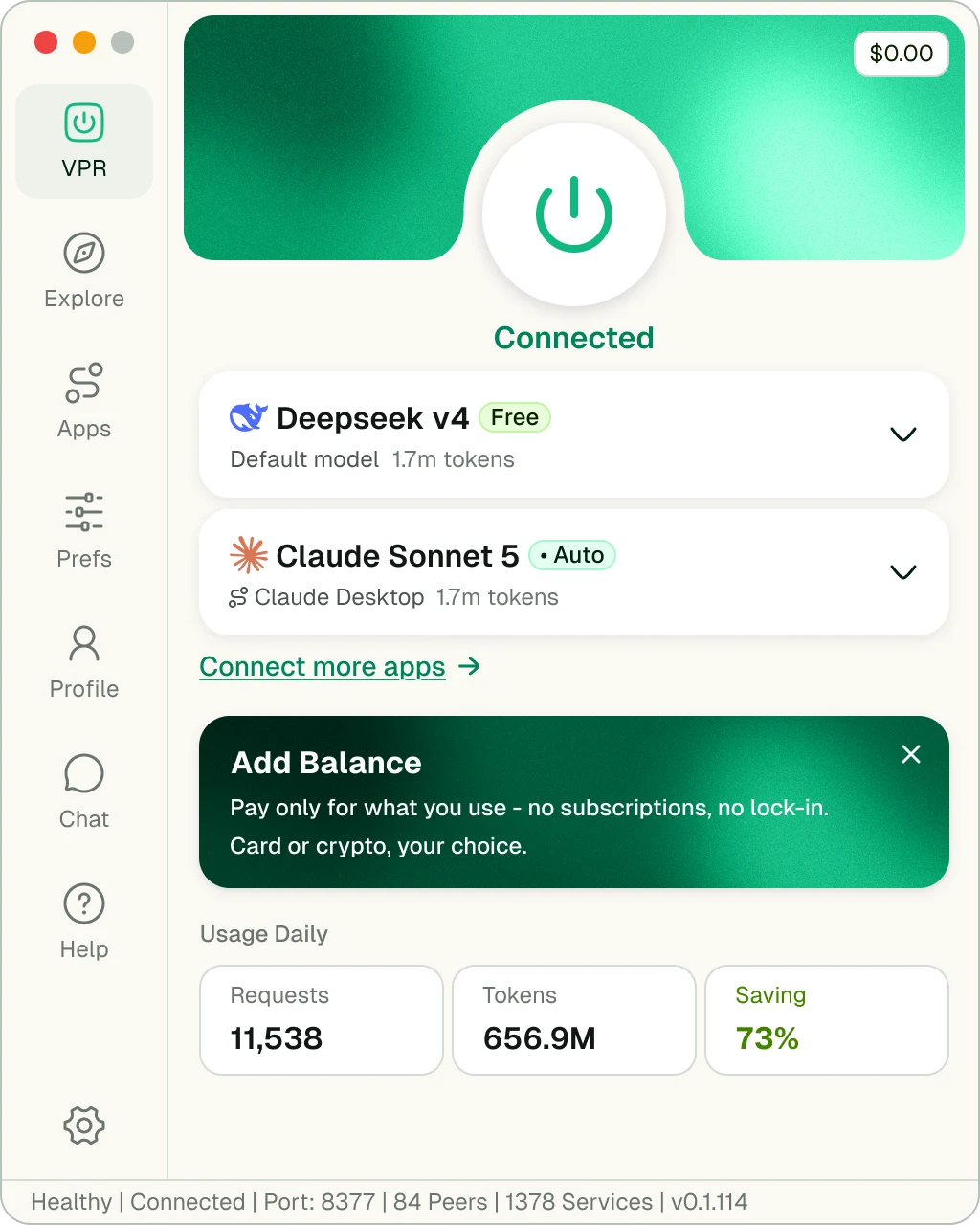
AntSeed VPR · running with usage
/vpr · activeRequests · Tokens · Saving
4.2 - In use

Proof, the moment it exists.

Once traffic flows, a usage strip appears: requests, tokens, saving. Only saving is green, because it is the only figure that answers why the app is open.

  • UI decisions
  • The usage strip appears with traffic rather than reserving empty cells
  • Saving is the only figure rendered in green
  • The balance prompt arrives after proof, never before it
/vpr · active Requests · Tokens · Saving
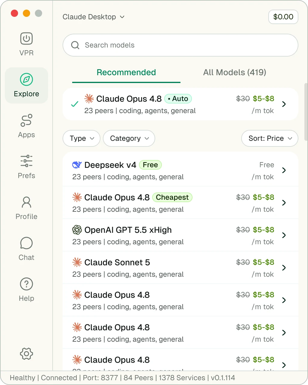
AntSeed VPR · model market
/explore419 models · peers · price band
4.3 - Explore

Every row is an argument about price.

Hundreds of models is a filtering problem, so the default view is a short Recommended list. Each row shows the official price struck through against the live band, and one-word badges do the ranking.

  • UI decisions
  • Recommended is the landing tab, All Models sits behind it
  • Every row carries the same four facts in the same order
  • One-word badges do the ranking: Cheapest, Auto, Free
/explore 419 models · peers · price band
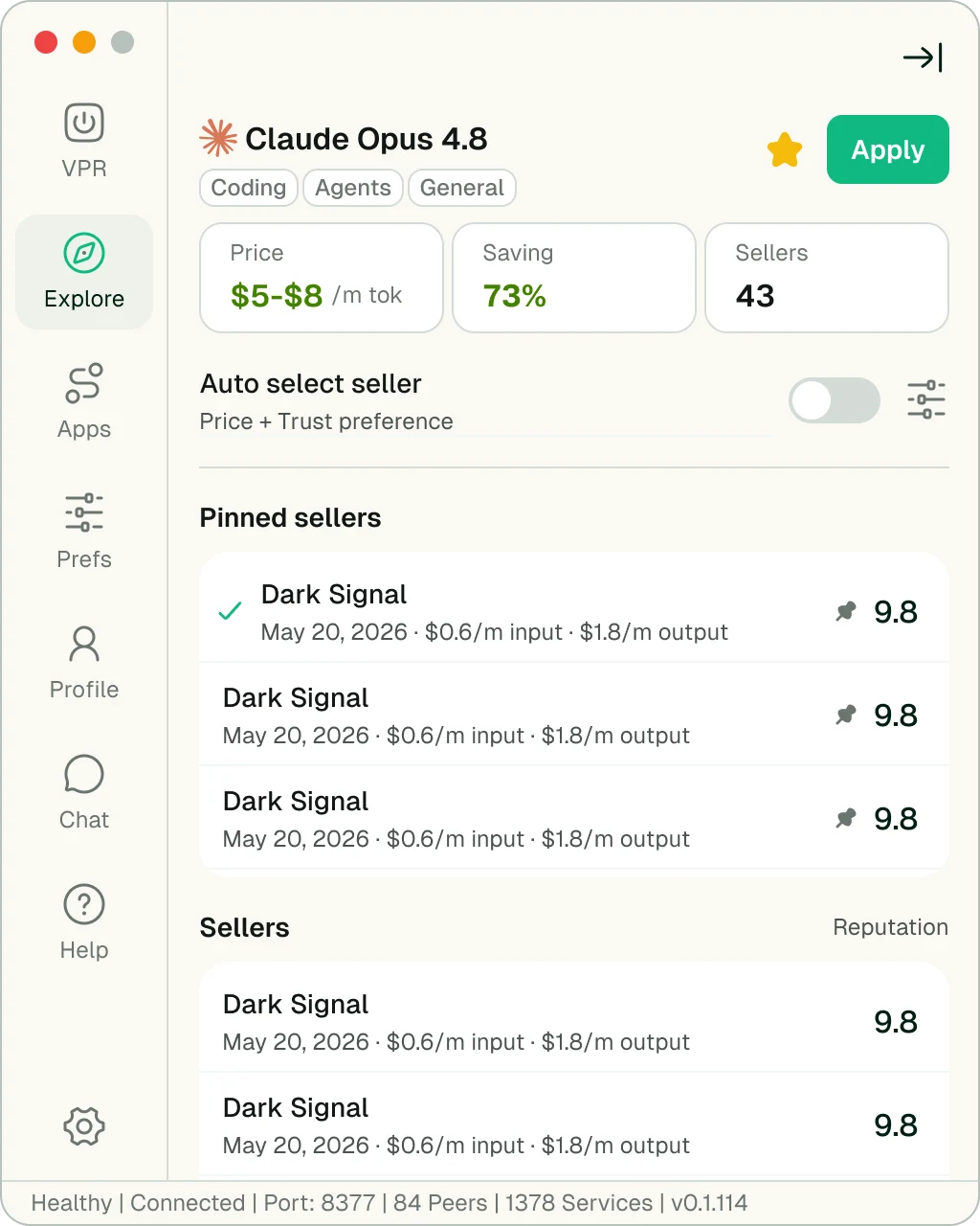
AntSeed VPR · model page with Auto select off and pinned sellers
/explore · modelAuto select · Pinned sellers
4.4 - Auto select

One switch decides who decides.

With Auto on, the router picks from one list ranked by reputation. Turn it off and a Pinned sellers group appears above the market, so the choice becomes the user's to keep.

  • UI decisions
  • Auto on: one ranked list, with the router's pick marked in place
  • Auto off: Pinned sellers appear above the market, nothing is removed
  • Price, saving and seller count stay fixed at the top in both states
/explore · model Auto select · Pinned sellers
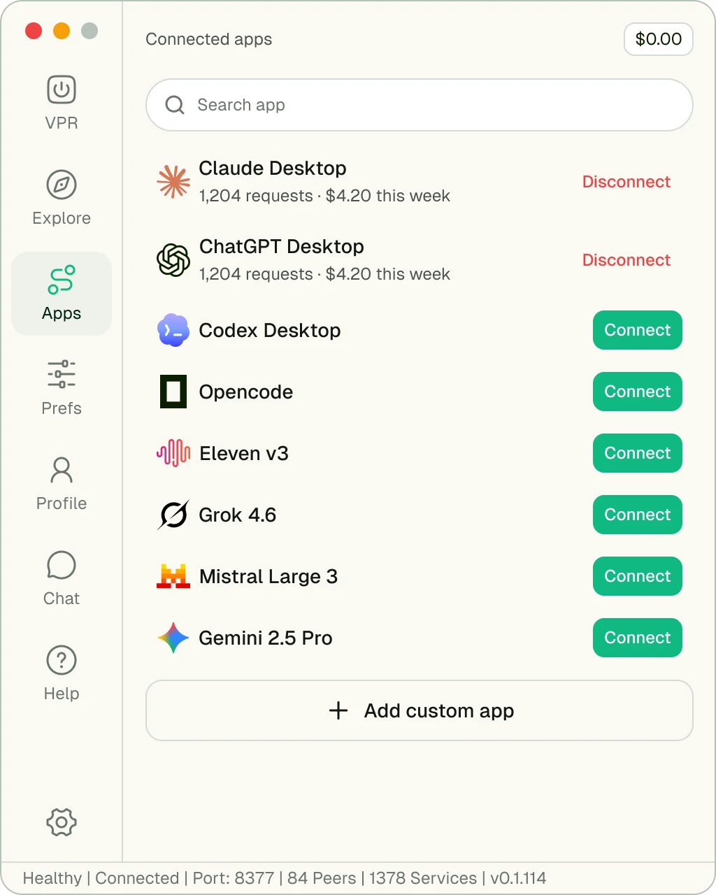
AntSeed VPR · connected apps
/appsConnect · Requests · Spend
4.5 - Apps

Keep the tools you already have.

The strongest thing AntSeed can say is that nothing changes. Each tool is one Connect button, and on software that sits between a user and their paid tools, the exit is as visible as the entrance.

  • UI decisions
  • One button per row, and the same button every time
  • Connected rows report their own request count and weekly spend
  • Disconnect stays visible in red rather than hiding in an overflow menu
/apps Connect · Requests · Spend
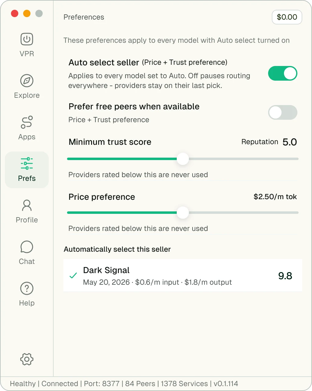
AntSeed VPR · routing preferences
/prefsTrust score · Price ceiling
4.6 - Preferences

Delegation with a floor under it.

Auto-routing means a stranger's machine answers your prompt. This screen bounds it with a trust floor, a price ceiling and an opt-in for free peers, because a policy that needs a manual is one nobody sets.

  • UI decisions
  • Every control states its consequence, including the off state
  • Two sliders and two toggles is the entire surface
  • Seller, not peer, on the screen where money is being spent
/prefs Trust score · Price ceiling
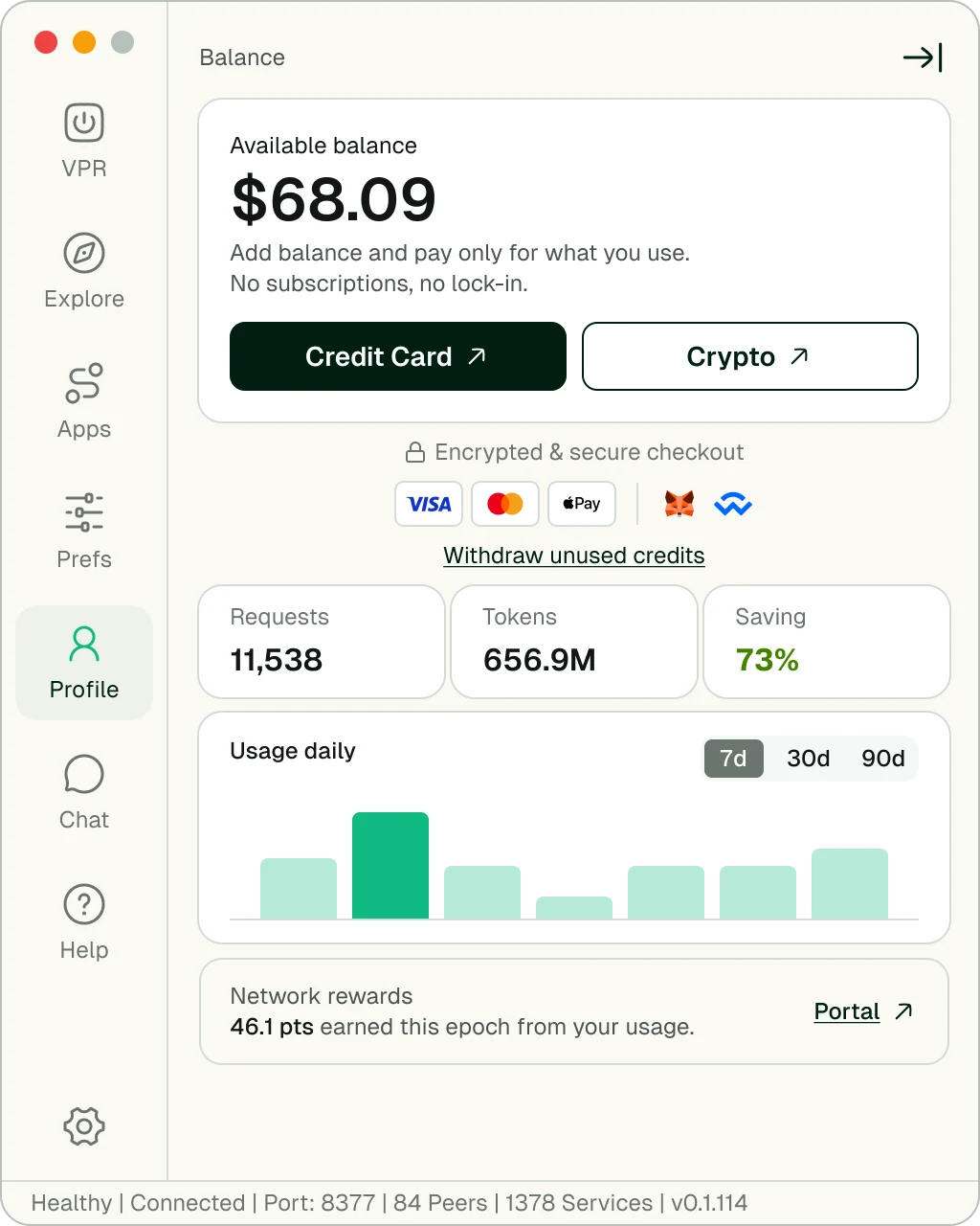
AntSeed VPR · balance and settlement
/balanceCard · Crypto · Withdraw
4.7 - Balance

Crypto, without the crypto tax.

"On-chain and non-custodial" is the sentence that loses a mainstream user. So the screen leads with dollars, puts Credit Card first, and shows how the money gets back out before asking for the first top-up.

  • UI decisions
  • The dollar figure is the largest thing on the screen
  • Credit Card before Crypto, as a peer rather than a prerequisite
  • Withdraw stated in plain words directly under the payment methods
/balance Card · Crypto · Withdraw
AntSeed VPR
01 / 07
VPR · connected
/vprPower · Default model · Apps
VPR · running with usage
/vpr · activeRequests · Tokens · Saving
VPR · model market
/explore419 models · peers · price band
VPR · model page, Auto select off
/explore · modelAuto select · Pinned sellers
VPR · connected apps
/appsConnect · Requests · Spend
VPR · routing preferences
/prefsTrust score · Price ceiling
VPR · balance and settlement
/balanceCard · Crypto · Withdraw
05 / The site

An argument, in the order it has to be made.

antseed.com is a sequence, not a feature list: cheaper, private, unownable, then compatible with what you already use. Each section answers the question the last one raised.

Structure

The page opens on the product, not an illustration: the VPR at the centre of a dot field that resolves into the ant mark.

Objections come in the order they occur. Price, because that is why anyone clicked. Privacy, because "peer-to-peer" raises it. Ownership, for who is in charge. Then compatibility, the argument that closes.

Every section is a rebuttal. The order is the design.
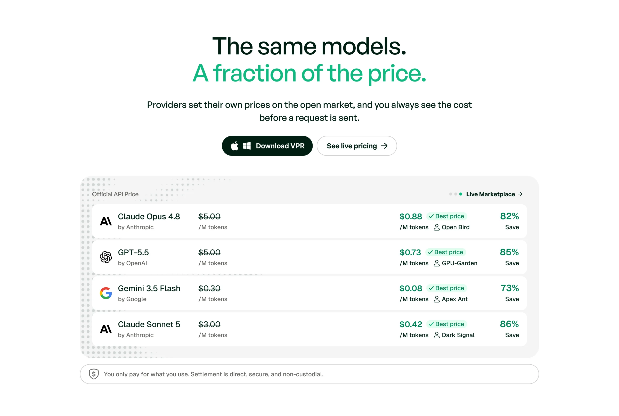
AntSeed site · pricing comparison table
01The same models. A fraction of the price.
Official API price against the live market best, per model, with the saving as its own column. The table settles the headline's claim.
AntSeed site · private by design
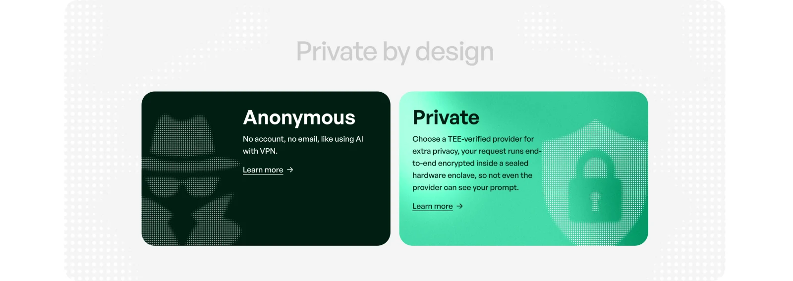
02Private by design
Anonymous (no account) and private (TEE-verified hardware), kept apart because blurring them is how privacy claims stop being believed.
AntSeed site · owned by no one
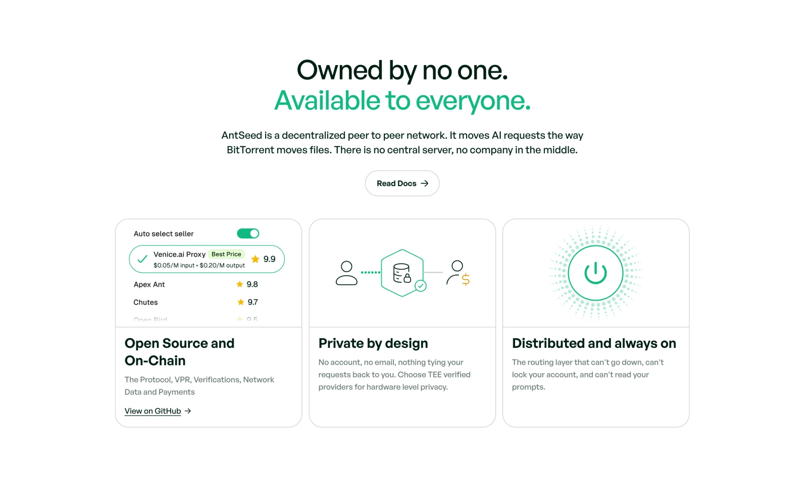
03Owned by no one
The architecture, anchored to the analogy everyone already has: BitTorrent, but for AI requests.
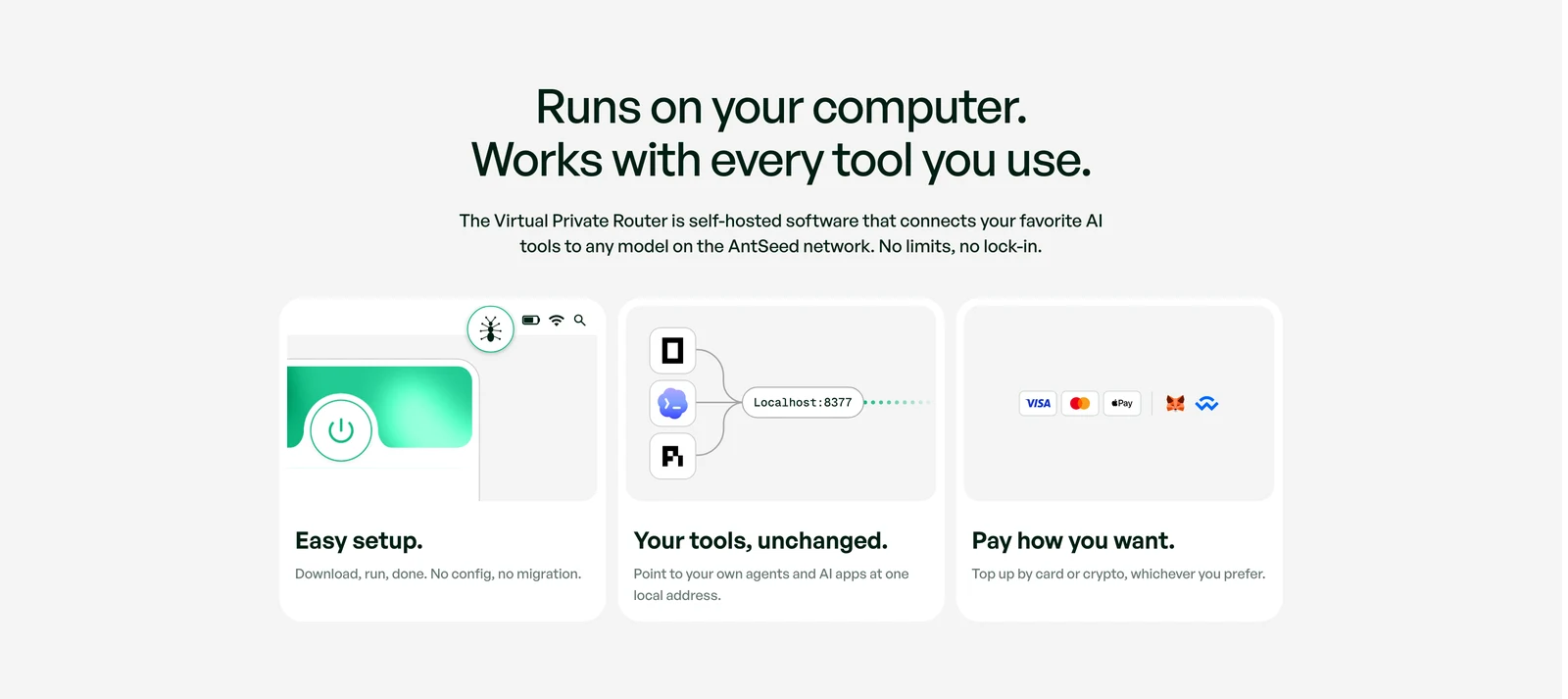
AntSeed site · runs on your computer, works with every tool
04Runs on your computer
Three cards for the three doubts left: setup, compatibility and payment. Each answered in one line, with the product drawn rather than described.
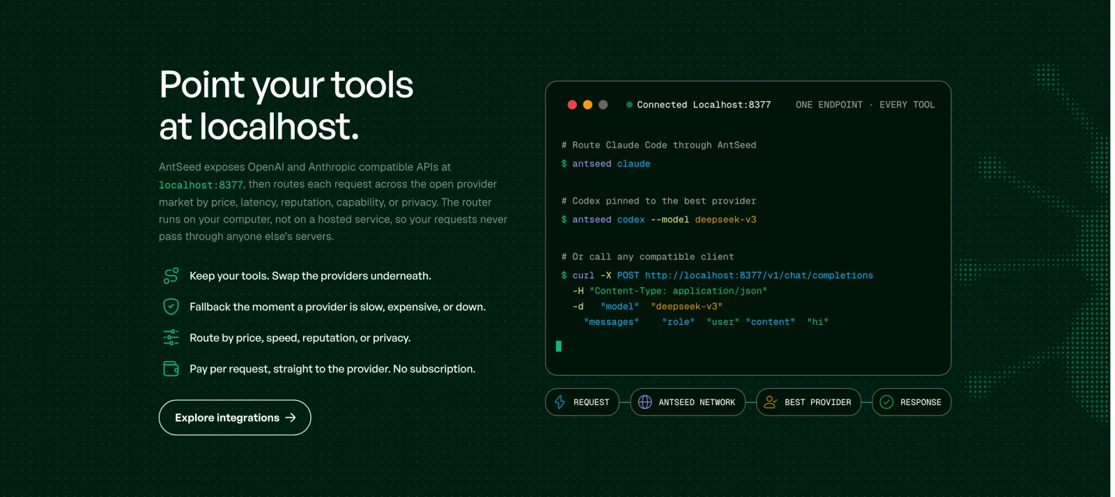
AntSeed site · point your tools at localhost
05Point your tools at localhost
The only place the site goes dark. A live terminal types the real commands while the request path animates below, because this section has to be technically exact.
06 / System

The bones: tokens, type, parts.

One mark, five colors, two typefaces and a single primitive. The app, the site and the films all draw from the same set.

#10B981
#24CD95
#001E12
#E2FFF0
#FBF9F4

Color system

5 tokens: live, mint, void, tint, paper. Green is reserved for state that is actually live.

Geist
Semi Bold Medium Regular Mono

Typography

Geist for everything the user reads. JetBrains Mono for what the protocol says: ports, prices, peer counts.

The AntSeed ant mark rendered as a halftone dot field

Halftone mark

The ant broken into a dot field. It sits behind the site hero and runs through the films, so the brand reads as texture before it reads as a logo.

AntSeed components: buttons, badges, select, slider, search field and toggles

Components

Buttons, one-word badges, select, slider, search and toggles, with Disconnect kept visible in red.

AntSeed sidebar icon set in its default and active states

Iconography

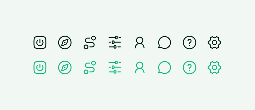
One outline set for the sidebar, from VPR to Settings. Ink at rest, green only on the active view.

The AntSeed power button set into the connected gradient

The power button

The product's one primitive, set into a gradient that only appears while the router is on. Everything else stays ink on paper.

07 / Outcomes

What shipped, and what I'd do differently.

The network is live and its numbers are its own. What I can claim is the surface people meet it through.

After ship

Making the power button the product paid for itself again and again. It became the sidebar icon, the favicon, three films and the site hero. When a system has one primitive, the rest of the work gets cheaper.

What I would change: I designed the model market before I saw how wide real price bands get. The same model is quoted at four prices from four machines, so that surface wants a distribution, not a single figure. It is the next thing I would rebuild.

Models
610+

Available on the open market through one local endpoint

Providers
158+

Independent peers setting their own prices

Product views
10

Designed across the VPR desktop app and its states

Website sections
16

Sequenced as one argument, from price to compatibility

Network figures from antseed.com and antscan.co: 82B+ tokens processed and $143K+ settled to providers as of September 2026. They measure the network, not the design.