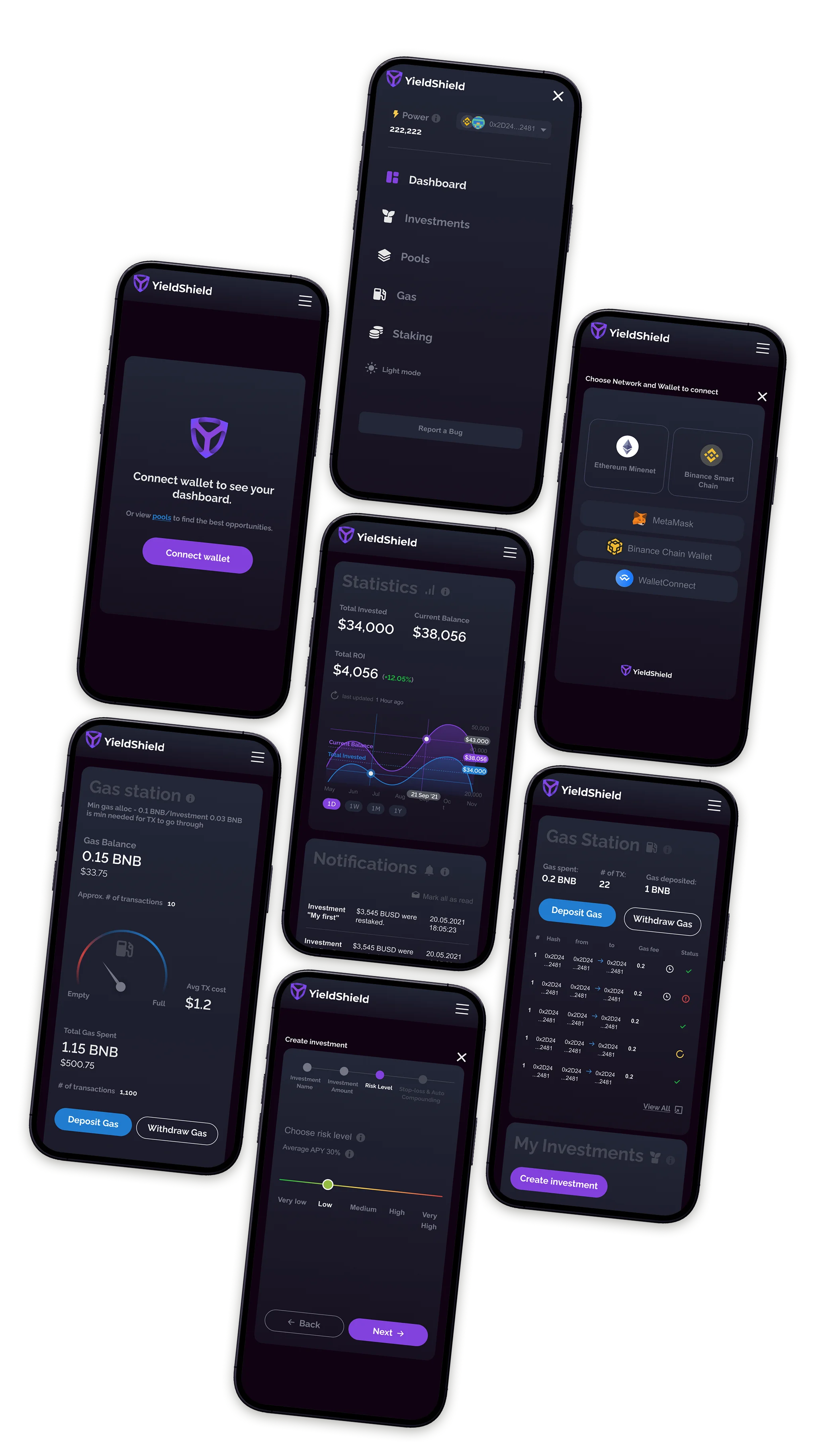
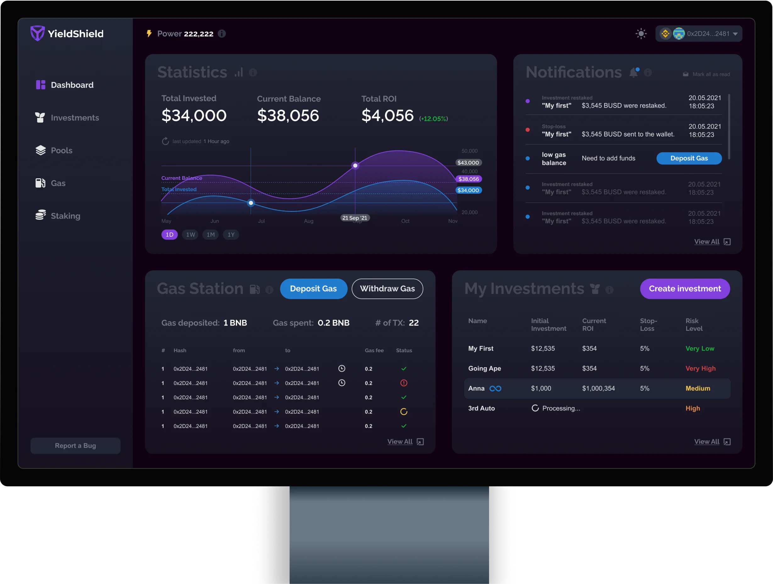
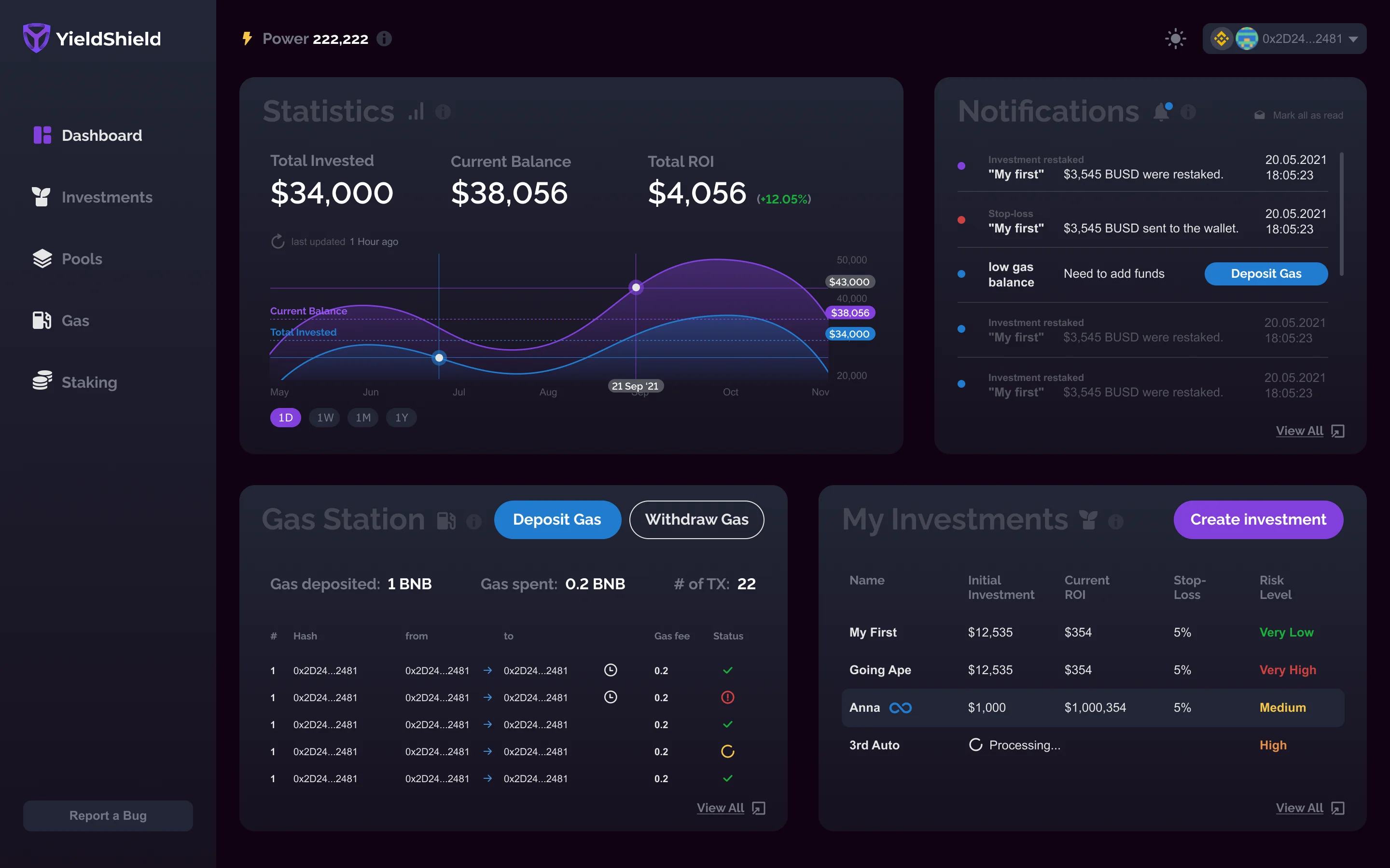
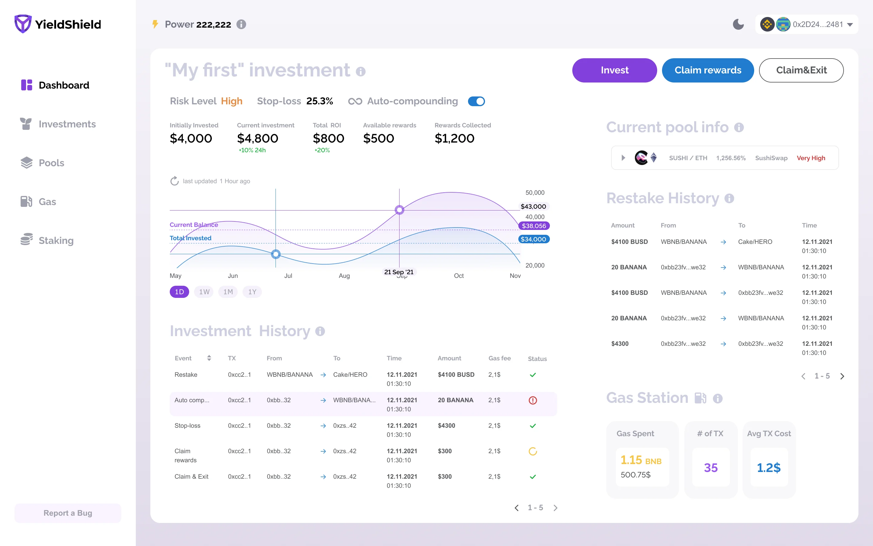
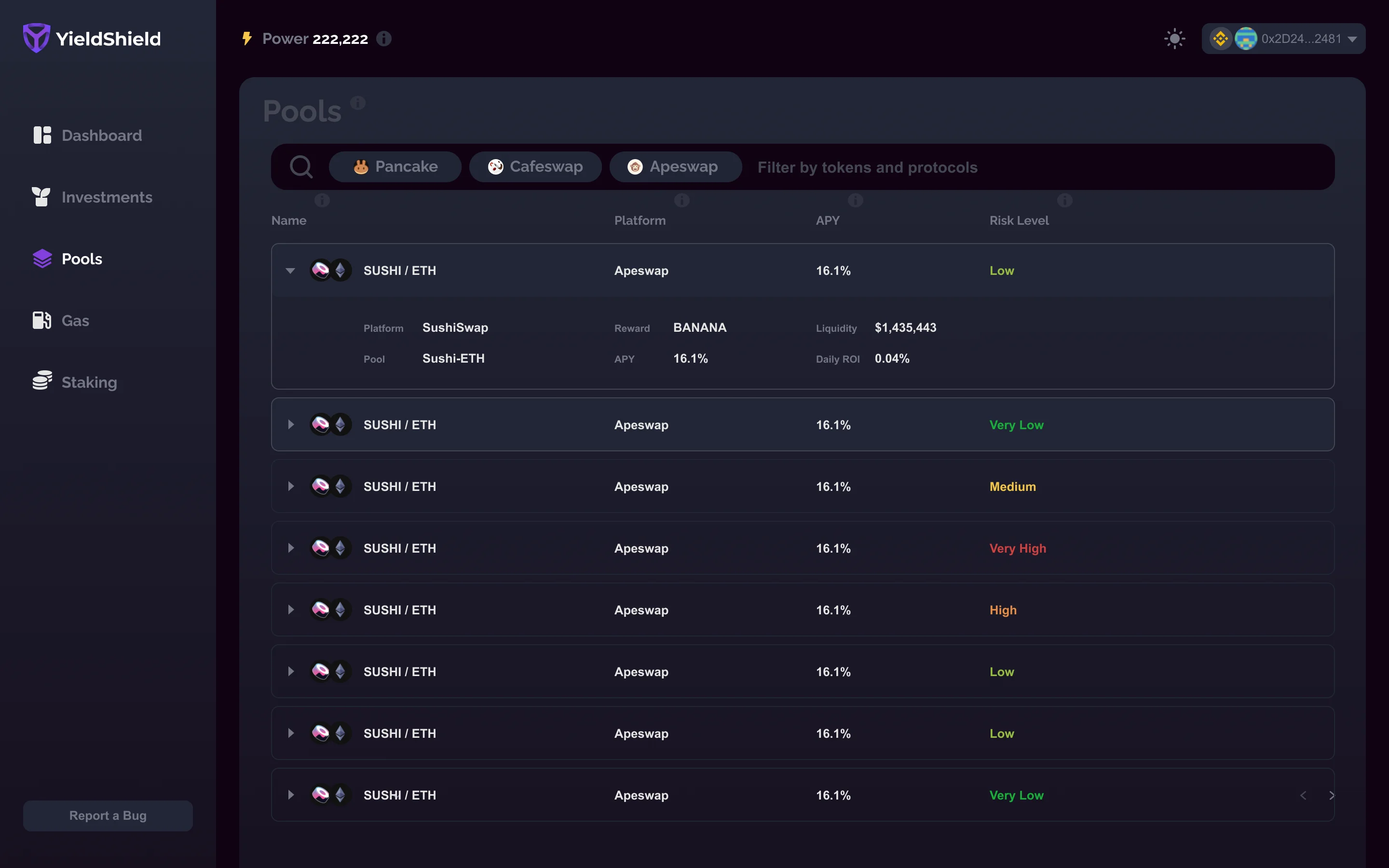
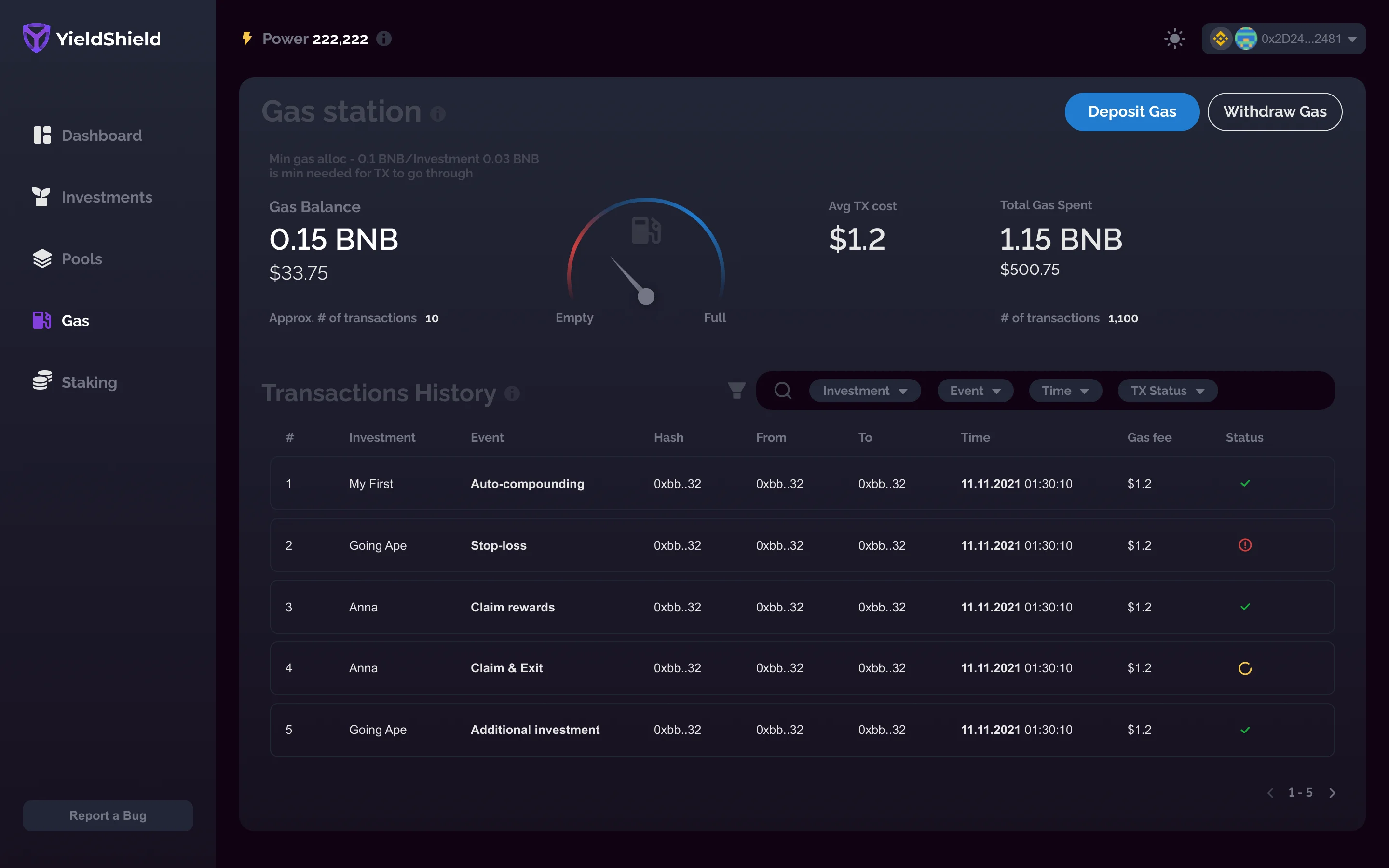
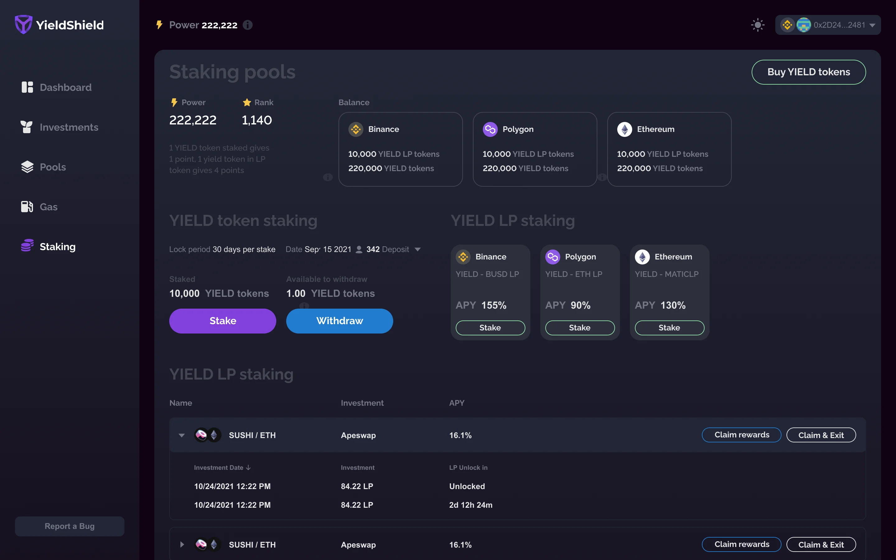
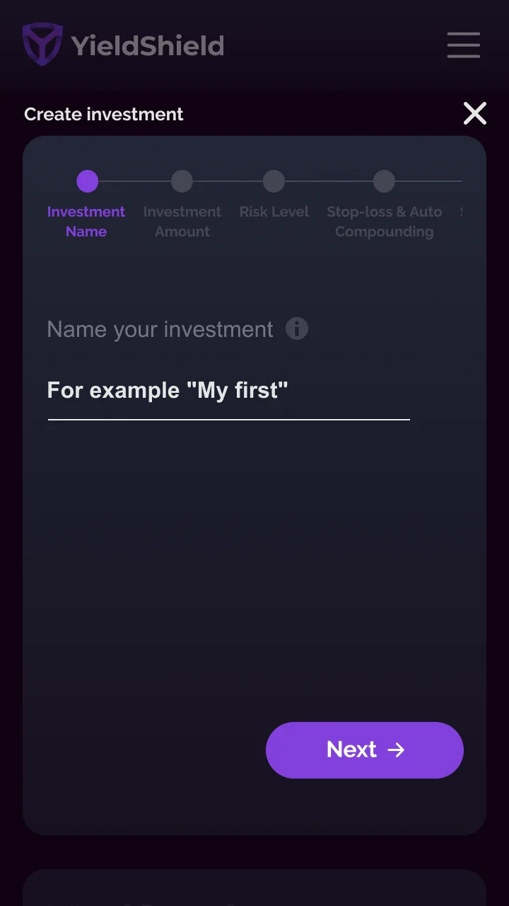
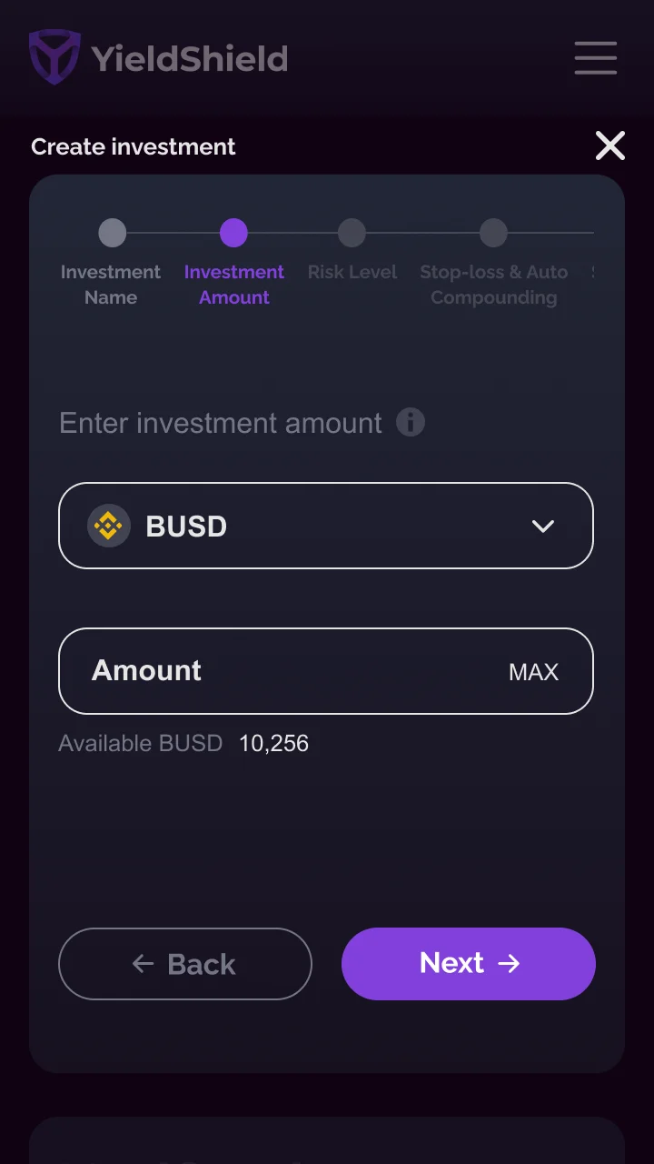
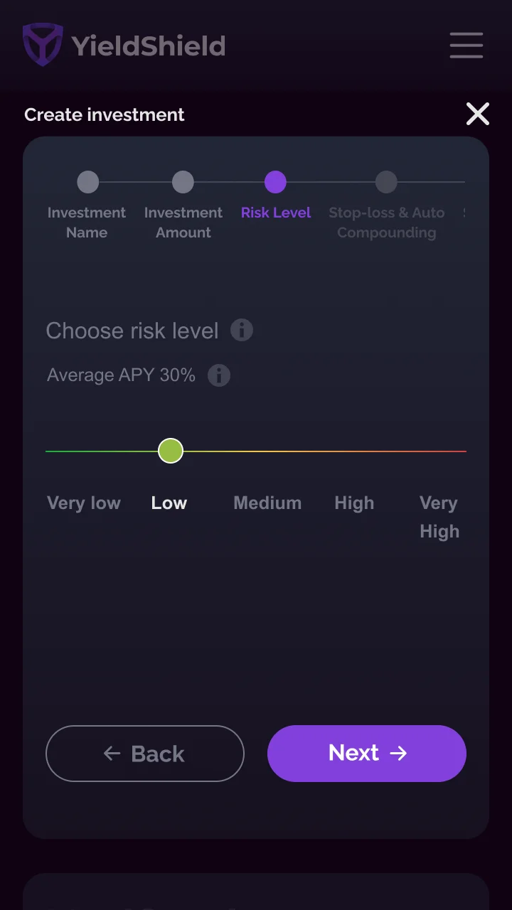
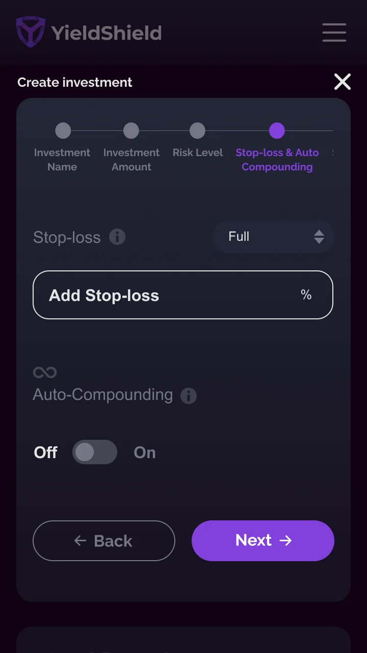
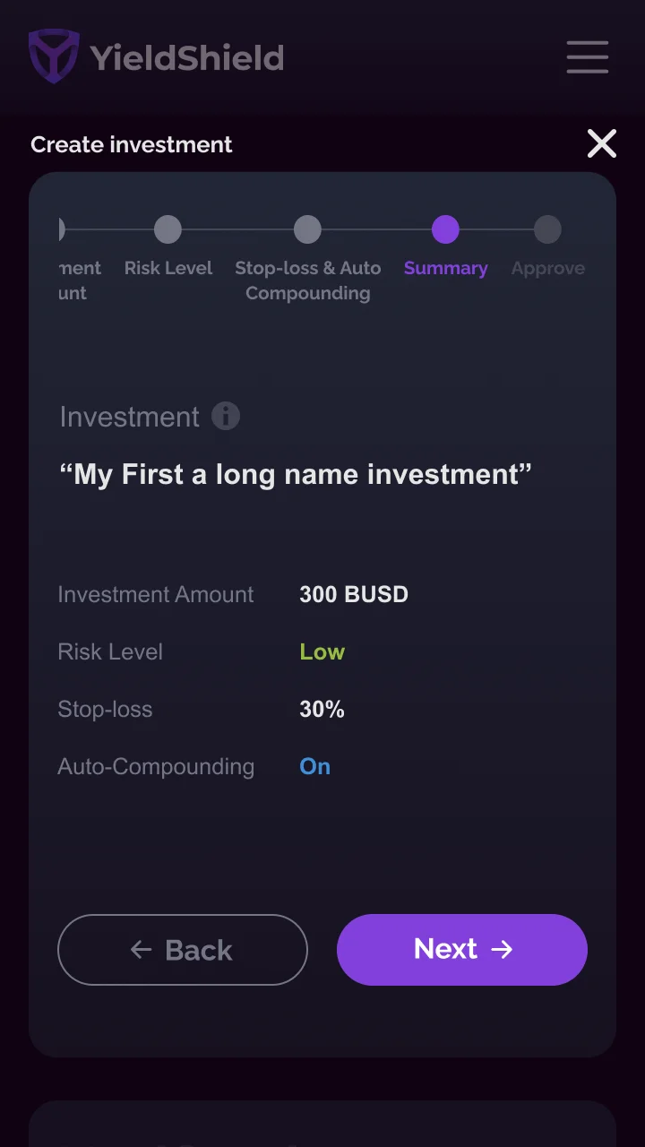
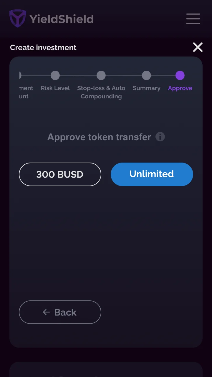
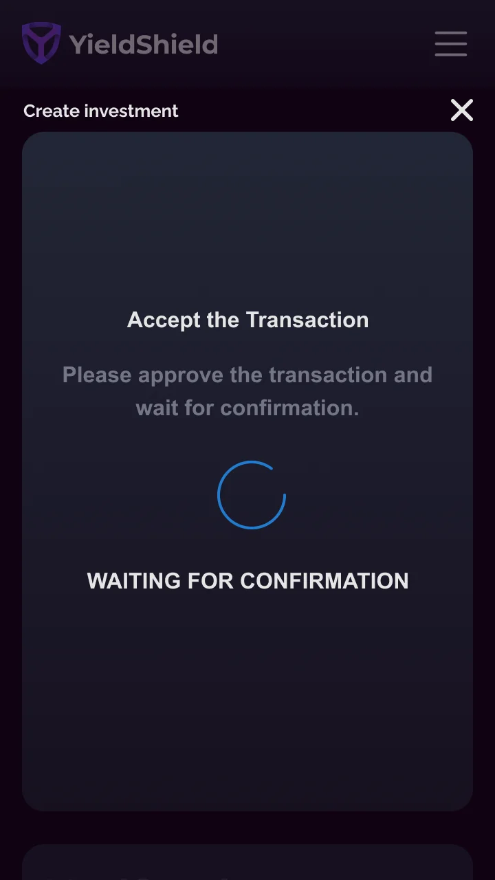
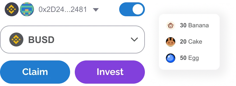
Full zero-to-one design for YieldShield: an AI-powered DeFi dashboard that automates yield farming across Binance, Polygon, and Ethereum. Dashboard, data viz, mobile app, and a design system from scratch.
YieldShield layers AI and smart contracts on Yield Protocol to automate yield farming, so users who don't speak DeFi can still participate.
The ask: design a dashboard that lets any user, DeFi-native or DeFi-curious, set up an automated investment strategy and trust the platform to act on their behalf. One roof for Binance Smart Chain, Polygon, and Ethereum.
One designer. Three chains. Six months from zero to shipped. Dark and light mode from day one.
Before a single frame was drawn, I mapped every friction point between a new user and their first automated investment. The problems were structural, not cosmetic.
Gas fees failed transactions silently. Users had no visibility into their balance or burn rate until it was too late. Risk was either unlabeled or buried in tooltips. Claiming rewards and re-staking were separate manual actions users had to remember to do. Mobile didn't exist. The interface was built for insiders; everyone else was one failed transaction away from leaving.
Surface everything the user needs to know, automate everything they shouldn't have to do manually. Gas got its own dedicated station: visible balance, deposit/withdraw, burn rate and estimated transaction count all in one view. Risk got a plain-English label on every pool and every investment row.
Dark and light from day one. Mobile parity from day one. Auto-compound became a toggle in the wizard, not a separate workflow to hunt for.
Every surface of the platform (dashboard, investments, pools, gas, staking) is built from the same tokens, the same 8pt spacing scale, the same Raleway type system. The product feels like one thing because it is one thing.

Everything that matters in one viewport: total invested, current balance, total ROI, and a live area chart. Below: a real-time notifications panel, the gas station widget, and the active investments table. No hidden tabs for the things users check every day.

Active and inactive investments in a single scannable table, sortable by risk level, current ROI, and APY. Risk is never buried: Very High, High, Medium, Low, Very Low appear as color-coded inline badges on every row.
Drill into any position for a live P&L chart, restake history with token routing, and an embedded gas station. Invest more, Claim rewards, Claim & Exit, always in context, never two screens away.
↳ Shown in light mode. User research showed ~30% of users preferred light, so both were shipped day one, with dark as the default.

Browse by protocol (PancakeSwap, CafeSwap, Apeswap) with APY and risk level visible at a glance on every row. Expand any pool to reveal pair details, liquidity depth, and daily ROI. Power-user depth, first-timer legibility.

Most platforms let gas stay invisible until a transaction fails. YieldShield surfaces your BNB balance, an analog gauge showing full/empty state, estimated transaction count, average gas cost, and a full filterable transaction history. Deposit or withdraw in two clicks from the same screen.

YIELD token and LP staking across Binance, Polygon, and Ethereum, each showing balance, APY, lock period, and actions. All three chains in a single view.
The hardest UX problem on the platform: guiding a user through setting up a fully automated DeFi investment without triggering analysis paralysis. Every step had to earn the next one.
Every configuration in the wizard carries real financial consequence. Users are setting up a bot that will trade on their behalf, with real money, on a live blockchain. There's no "undo." Clarity at each step was not a nice-to-have.
The design response: one decision per screen, progressive disclosure, and a persistent step indicator. Risk in plain English (Very Low to Very High), not numeric scores. Stop-loss explained inline. The Summary step lets users edit any choice without losing the others.


Four primary colors. One typeface. An 8pt spacing scale. Everything on the platform, desktop and mobile, dark and light, derives from these three primitives.
5 semantic tokens: brand, action, surface, success, error. Consistent across dark and light.
Raleway for UI, JetBrains Mono for data and labels. Predefined scale from H1 to caption.
8pt base grid. Every gap, margin, and padding is a multiple of 4px.
Buttons, inputs, badges, and cards, all built on the same token system.
12-column grid, 24px gutters. Responsive from 1440px desktop down to 320px mobile.
Both shipped day one. Research showed 70% dark preference. Dark set as default.
Numbers are directional. The lessons are the part that actually travels to the next product.
Designing a product where the core mechanic is automation meant constantly asking: what does the user need to see, and what can we spare them from? Gas Station was the clearest answer: a dedicated view for something every other platform buried in transaction failure messages.
The thing that worked: treating the wizard as a trust exercise, not a form. Every step that acknowledged uncertainty — plain-English risk labels, inline stop-loss, editable Summary — reduced drop-off.
Binance, Polygon, Ethereum under one dashboard
Filterable by protocol, APY, and risk at launch
From zero to a fully automated investment
Zero-to-one: design, system, mobile, shipped